Uppbeat UX Audit
Executing a strategic UX audit and user journey analysis for a market-leading creator music platform.
The Challenge
As the platform prepared to expand into new markets, the management team required an expert evaluation to identify friction points in the search, discovery, and licensing workflows.
The Solution
Leveraging my subject matter expertise as a musician and designer, I performed a comprehensive audit to pinpoint UX inconsistencies and opportunities for feature enhancement.
My Role
UX Consultant.
The Impact
The audit provided the leadership team with actionable insights to refine their product roadmap, ensuring the platform remains intuitive as it scales for a broader user base.
Introduction
I was engaged by Uppbeat to perform a strategic UX audit of their royalty-free music platform, specifically focusing on the intersection of user experience and creator workflows.
Given my background as a semi-professional musician, I was able to provide unique subject matter expertise that combined technical design analysis with a deep understanding of the end-user’s creative process. I was commissioned to identify high-impact optimisations across their core discovery and licensing journeys. Below are selected highlights from the audit documentation, outlining the strategic recommendations delivered to the Uppbeat management team.
Additional Observations
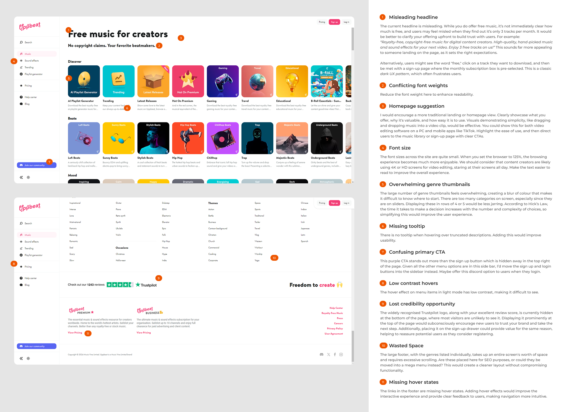
The fun and quirky Brandon font used in the Uppbeat logo works well, but I wonder if it clashes with the Futura PT font used elsewhere on the site. Futura PT, with its futuristic and edgy feel, doesn’t necessarily complement the playful and curvy nature of the Brandon font. The differences in how they render characters, particularly the letter ‘a’, are noticeable. Futura’s ‘a’ is more like an ‘o’, whereas the Brandon font retains a more traditional form with the arch above. This contrast may create a slight visual dissonance that could affect the overall cohesion of the branding. It’s worth considering whether a more harmonious pairing could be found to ensure consistency across the brand identity and user interface.
The playlist generator with ChatGPT-powered search is an excellent tool for helping users find the music they need quickly and easily. I recommend featuring this prominently on the homepage. Instead of labelling it as a playlist generator, consider framing it along the lines: “Find the music or effects you need with the help of AI.” This approach highlights the AI-driven aspect and aligns with user needs more effectively.
However, requiring site visitors to create an account before using the ChatGPT-powered search is problematic. This could be perceived as a dark UX pattern and is likely to frustrate users. It’s essential to ensure that the tool is accessible without forcing account creation, or alternatively, offer a free version to engage users effectively.
I found that including your employees' faces within the FAQs is a fantastic enhancement to the UX. It personalises the experience, making it feel like there are real people behind the service who are dedicated to making users' lives easier, rather than presenting a bland or faceless service site.
I believe having a trending section or category could offer significant value to users by allowing them to quickly find music that has been endorsed by other content creators. However, the ‘trending’ badge that appears on various tracks while browsing categories might deter some users from downloading those tracks. Content creators often seek unique music for their projects, and if a track is trending, it may seem less unique and more commonly used. Balancing the visibility of popular tracks with options for discovering less widely used music could cater to both preferences, enhancing overall user satisfaction.
The artwork for the music categories often features a person. I recommend conducting an A/B test to determine whether images of people on the covers resonate with the target audience. People often respond differently to visual elements, and this kind of A/B testing can help determine if the presence of individuals in artwork enhances user appeal or if other imagery might be more effective. It’s a practical approach to optimising visual content based on real user feedback.