Design System
Architecting a scalable, tokenised design system for a global B2B SaaS compliance platform.
The Challenge
Multiple engineering teams were developing fragmented products without a source of truth, leading to visual inconsistency and inaccessible MUI components.
The Solution
I architected an atomic, tokenised design system in Figma and oversaw the front-end development of all custom components and theming.
My Role
Lead UX/UI Designer.
The Impact
The business now operates on a unified, WCAG-compliant framework that has eliminated design debt and accelerated development speed.
Introduction
During my tenure at StarCompliance between 2023 and 2025, I undertook the challenge of creating a comprehensive and bespoke design system from scratch. As an international market leader in compliance software, StarCompliance owned six SaaS products at the time, each with their own components, navigation paradigms and colour schemes.
The objective was clear: unify these disparate products under a cohesive design system to enhance the overall user experience (UX) across their entire product suite.
In addition to unifying their existing products, StarCompliance was in the process of expanding its portfolio with four new products. It was essential that the new design system catered to both the legacy products and the upcoming additions, ensuring consistency and usability across the entire product range.
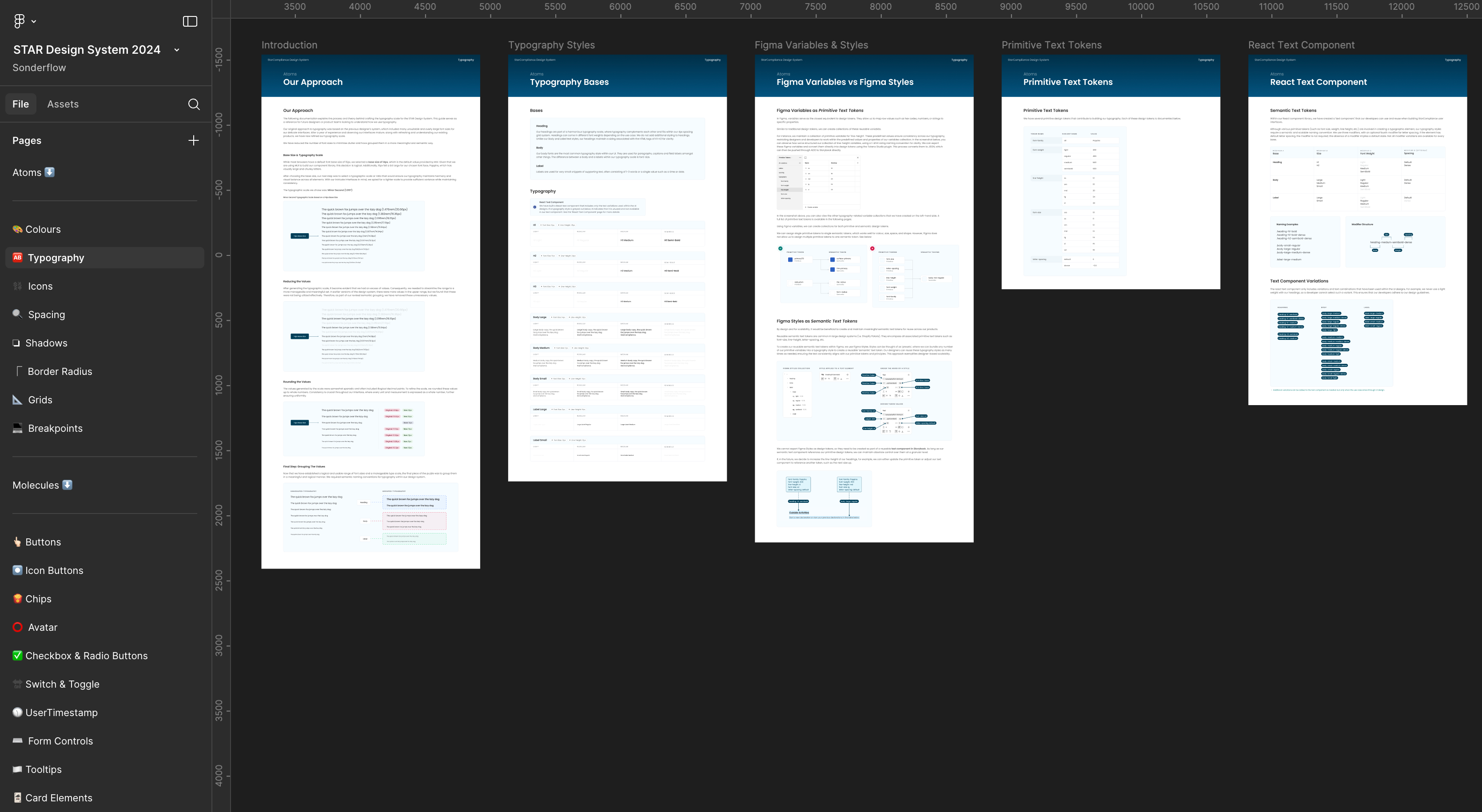
Atomic Design
I adopted an Atomic Design methodology when creating the design system, categorising smaller design elements such as colours and shapes as atoms. By combining atoms - like colour, typography, and shape - we created molecules, such as buttons. Larger components that integrate multiple molecules and atoms were classified as organisms.
In the above screenshot you can see how I structured the Figma Design System file, where each element had its own dedicated page (full of comprehensive developer-friendly documentation).
My initial focus was establishing the foundational Atomic Design principles and navigation paradigms, which served as the backbone for the entire system.
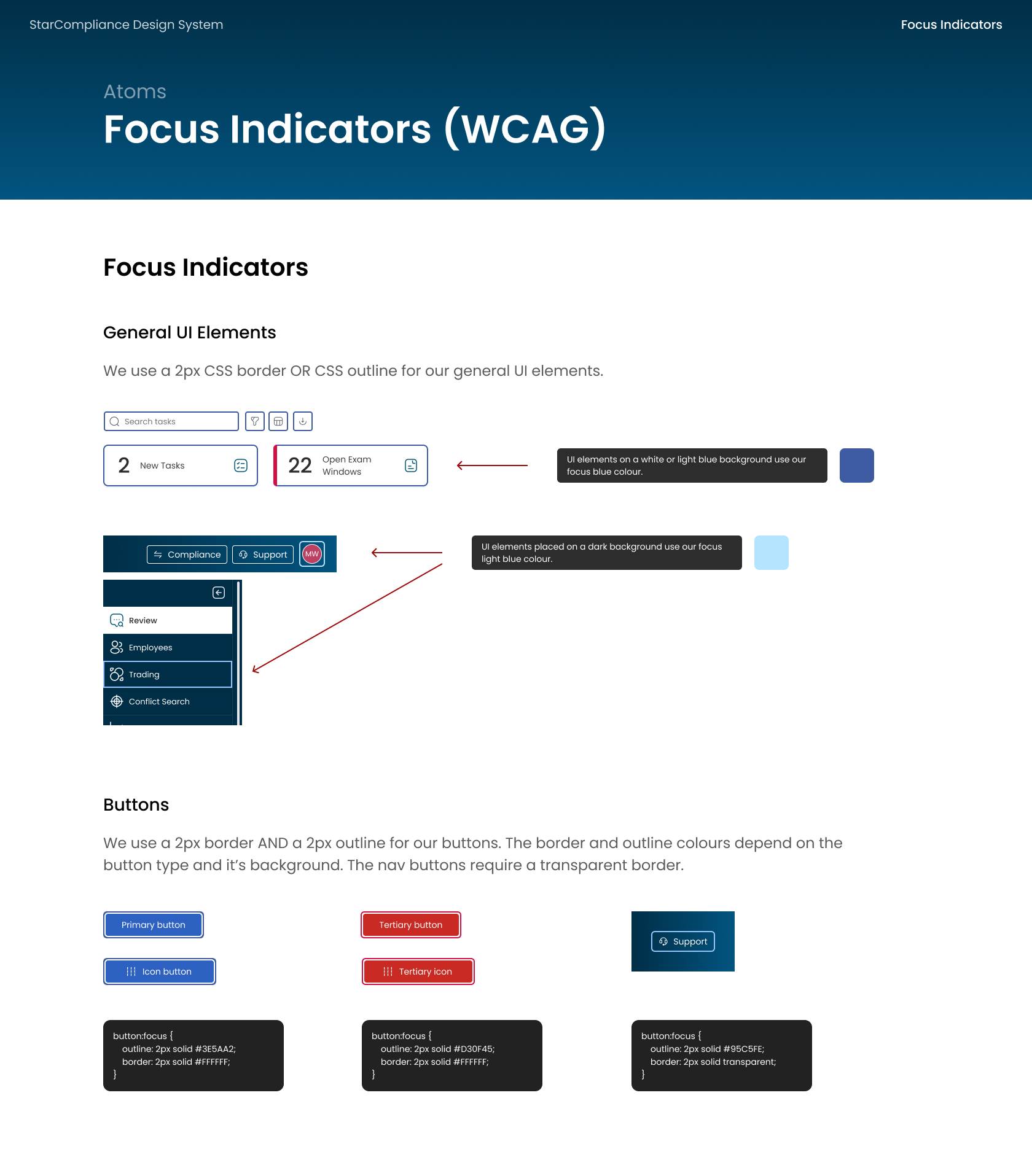
Throughout the process, all design decisions prioritised accessibility, aligning closely with the business's goal of achieving WCAG 2.2 AA accessibility conformance.
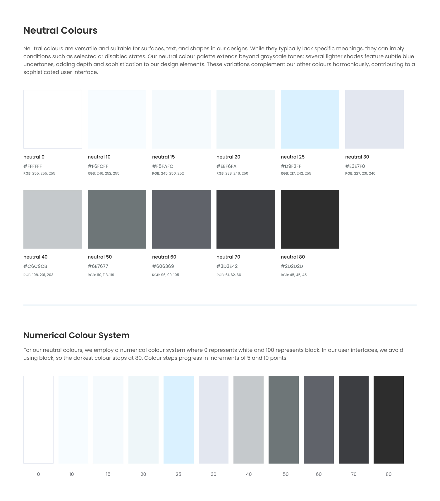
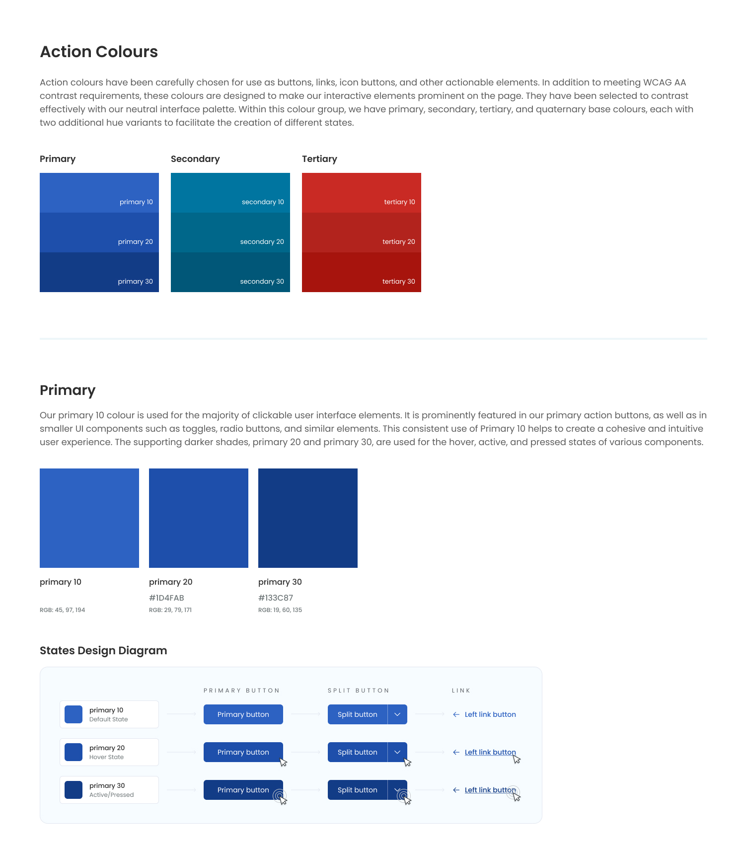
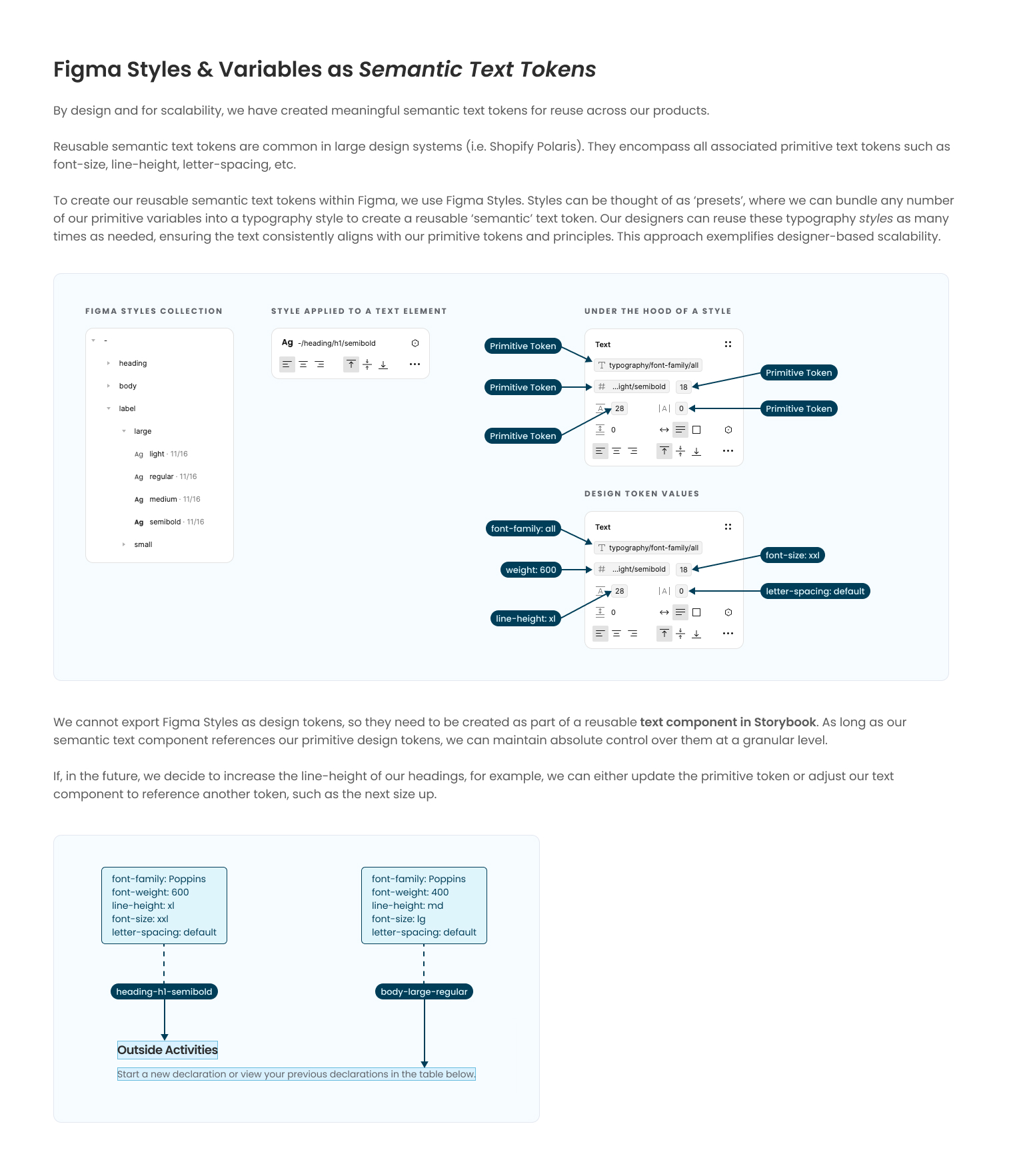
Typography Tokens
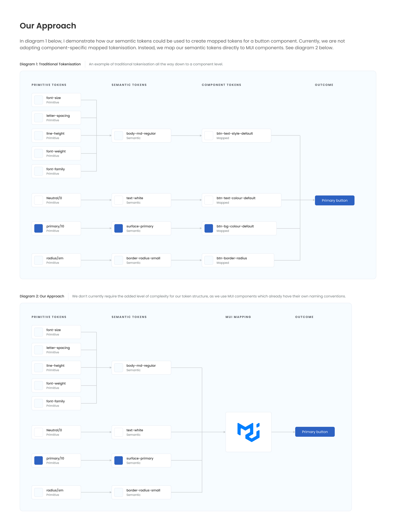
One key area of the design system was the creation of design tokens for scalability and consistency. As this is such an important and technical piece of work, I've decided to include the entire documentation for the typography tokens within their own project in my portfolio: Typography Tokens. For the moment though, here are a couple of screenshots from the typography pages within the design system.
I used a combination of both Figma variables and Figma Styles to create appropriate primitive and semantic tokens – these could also have been created in Token Studio (which I'm also familiar with).
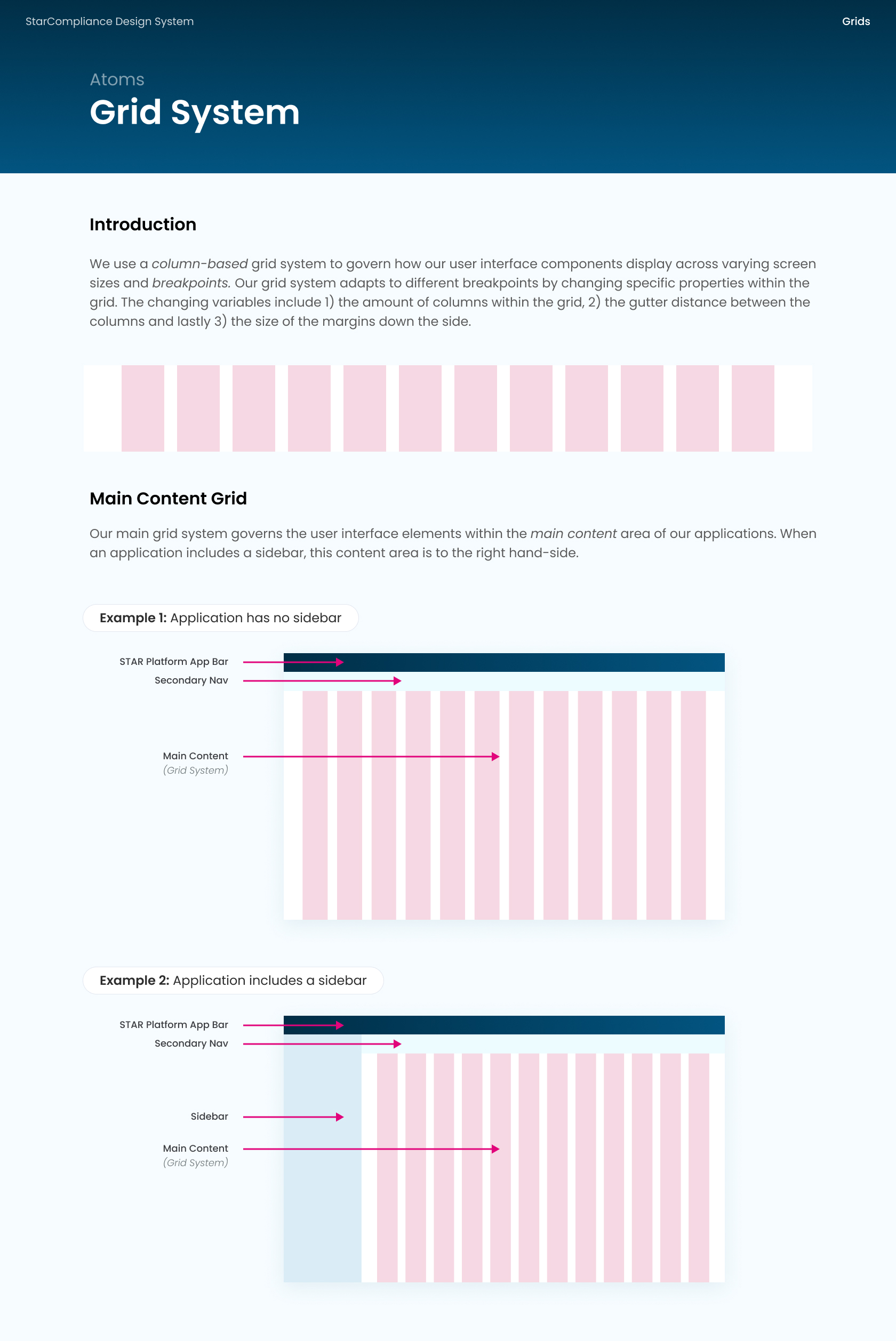
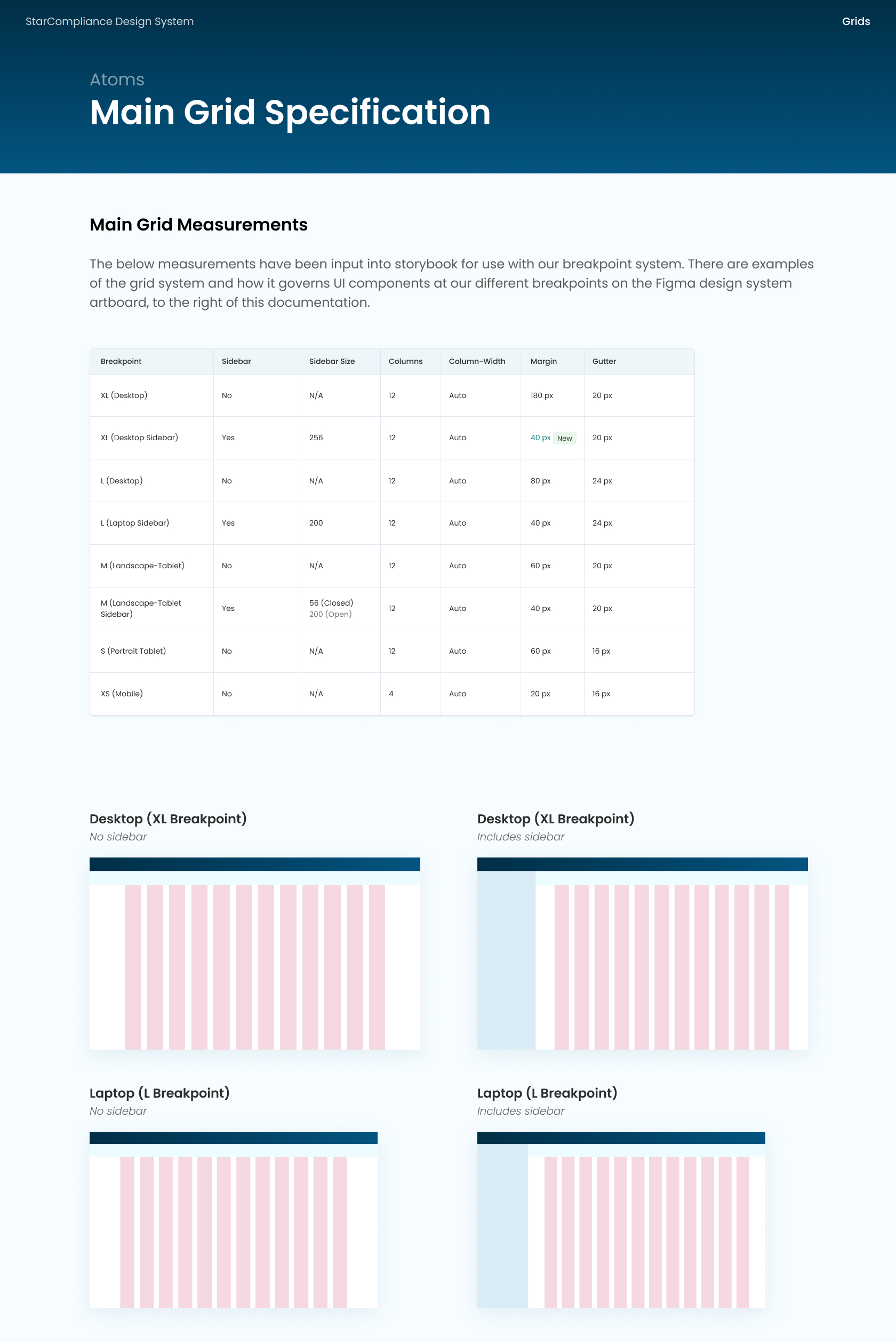
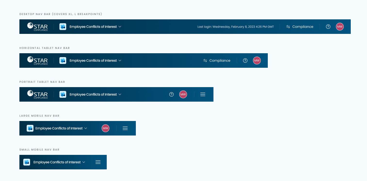
Responsive & Adaptive Design
As part of the design system, I developed a robust grid and breakpoint system to ensure that the new products and UI designs were responsive across various screen sizes and devices. Given that 90% of the company's users were using desktop devices, I adopted a 'laptop-first' design approach for our products.
It's important to note that not all components can collapse responsively by default. Therefore, I implemented adaptive design principles in cases where components needed to change or adapt based on specific breakpoints. Adaptive design was particularly applied to larger components such as navigation bars, sidebars, and data grid components.
When I first arrived, the front-end developers at StarCompliance didn't understand breakpoints or responsive grids. I had to host a number of sessions presenting how they work, how to use them, and why we use them.
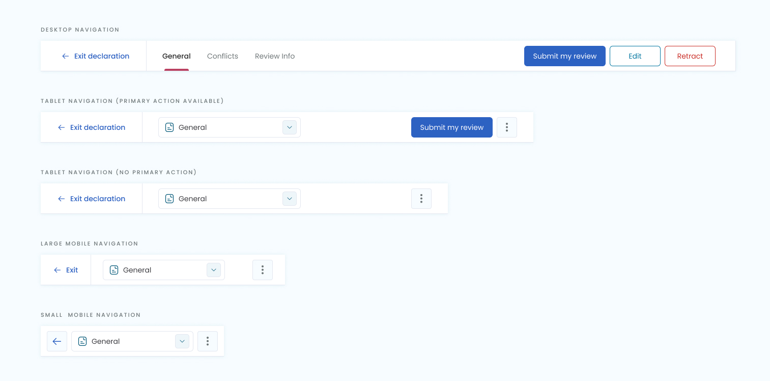
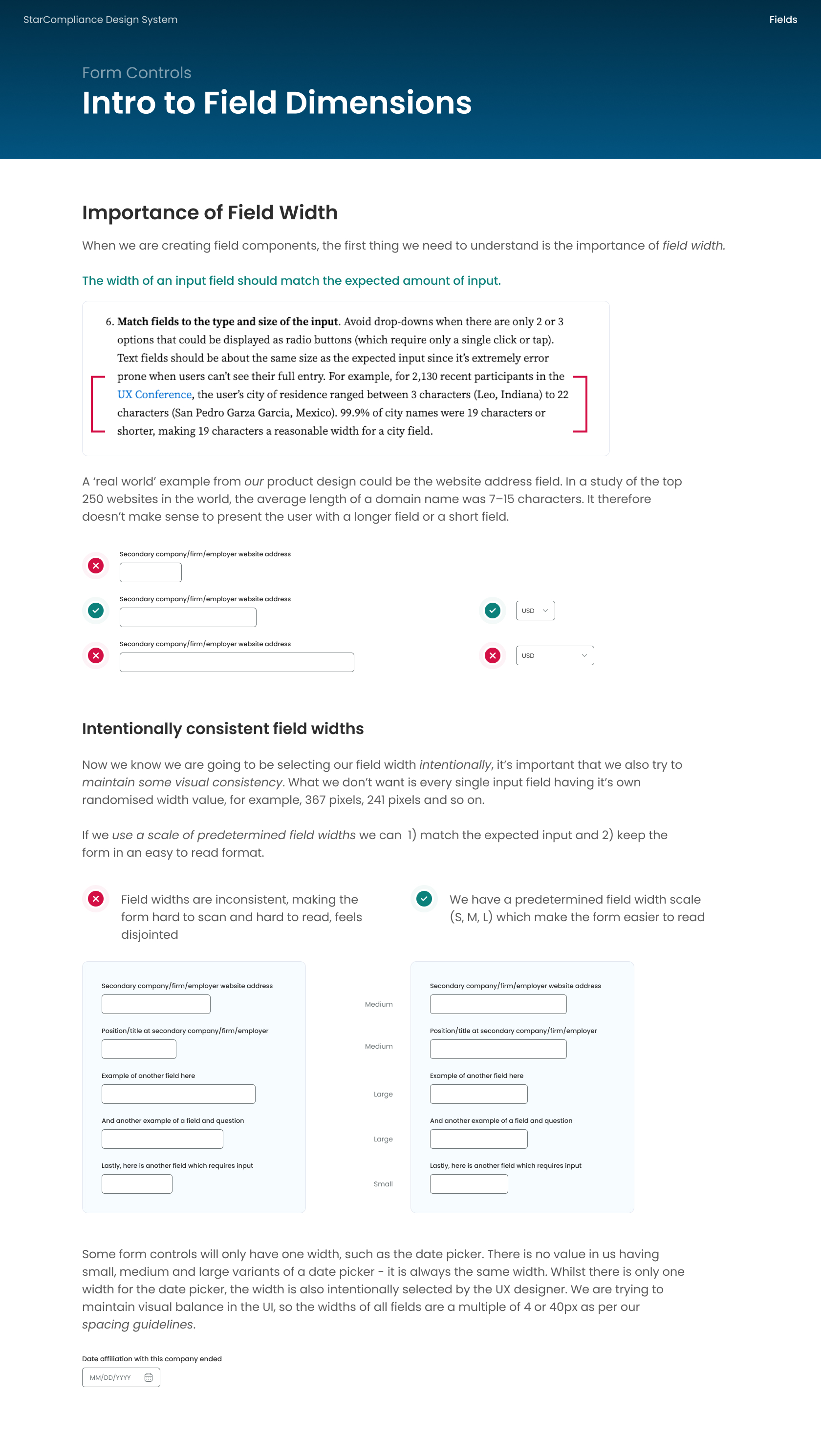
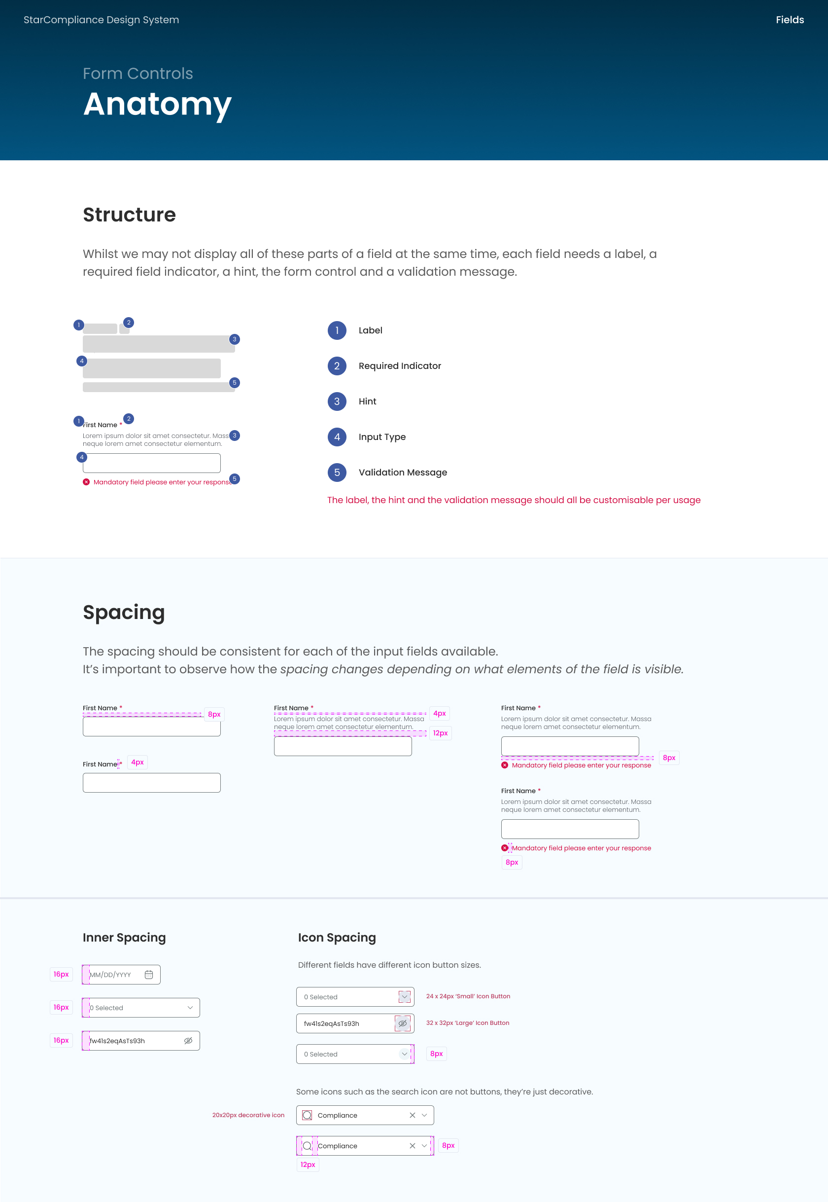
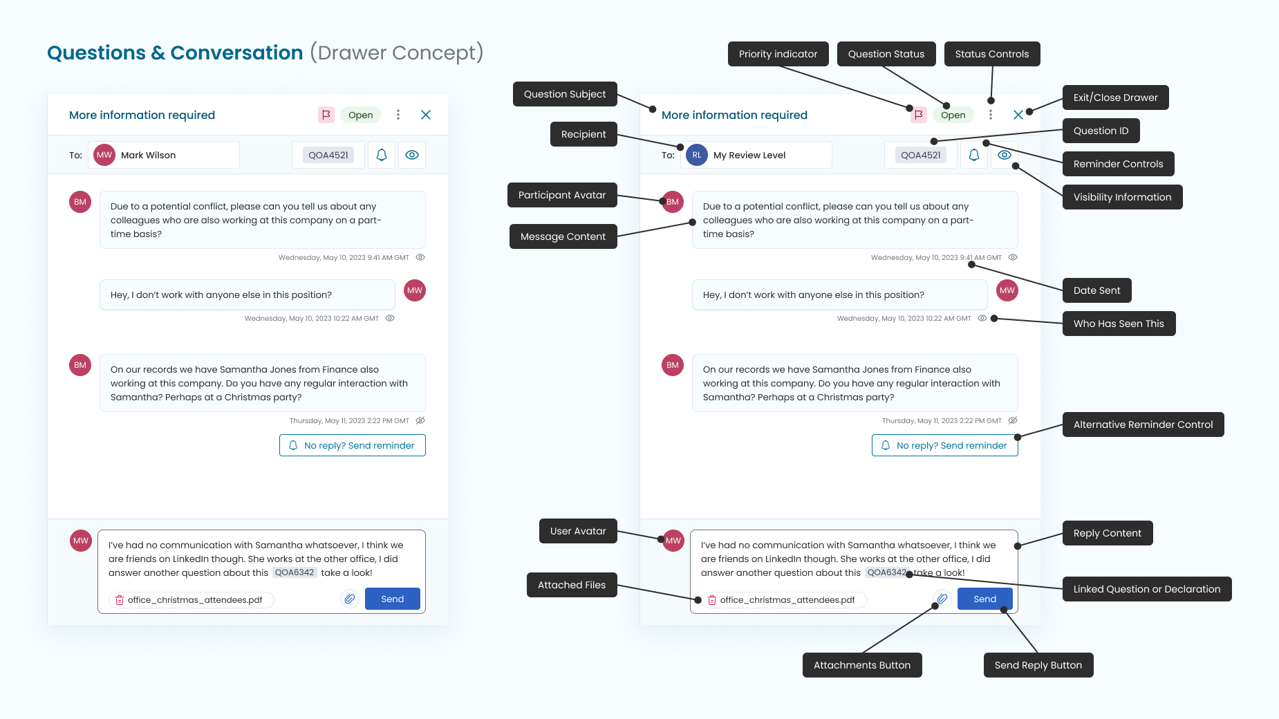
Developer Handover & Documentation
I used my expertise in CSS and HTML to ensure that the components could be accurately implemented by our front-end React developers. Documenting components is particularly enjoyable for me, as it allows me to thoroughly explore each potential use case and consider any additional state designs necessary for visual coherence.
I also implemented JavaScript functionality to differentiate between mouse-down and keyboard events, ensuring effective focus indicators were integrated in a user-friendly manner.
The screenshots below showcase some of the documentation I wrote to support the development and usage of varying design system components. It's important to keep a record of component-related design decisions, and by providing supporting UX theory and reasoning, it helps to get developer and product owner buy-in.
Additional Considerations
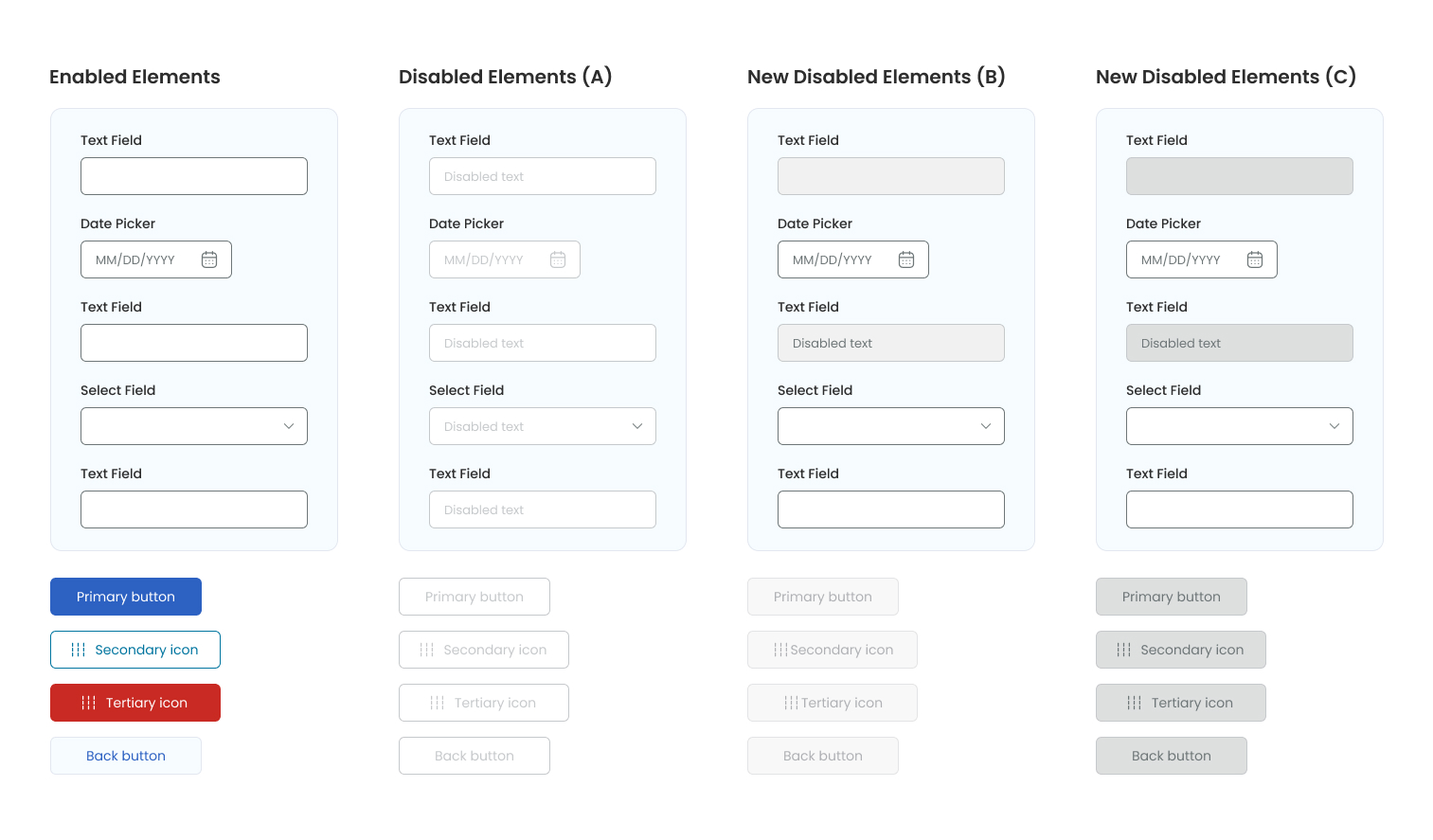
There were several additional challenges and considerations for the design system, including ensuring accessible focus states. While disabled elements aren't required to meet WCAG contrast requirements, I aimed to create disabled states that remained highly readable within the UI.
During the 'developer-friendly' documentation phase of the components, Figma introduced new tools within their Dev Mode feature, such as Rulers and Annotations. These tools provide developers with quick access to measurements and contextual insights into how each component should function, enhancing collaboration between designers and developers.
As a dedicated Figma enthusiast, I eagerly stay informed about and apply the latest updates and features, leveraging them to streamline our design and development processes.
Whats Next?
As we know, Design Systems are an ongoing evolution - they continually mature and are never truly finished! There will always be new requirements from Product Owners or UX designers for additional features or components.
Looking ahead, the next phase of the Design System process involves creating an internal-facing design system in Confluence. This system will encompass usage guidelines for development teams and product managers alike. Similar to the public-facing Carbon Design, this internal system will serve as a comprehensive resource, detailing how and when components are utilised. It will establish guidelines aimed at maintaining UI consistency and enhancing the overall user experience, thereby driving significant value across our projects.
Stakeholders and product owners will benefit from understanding these guidelines, ensuring cohesive UI implementation and fostering a unified user experience.
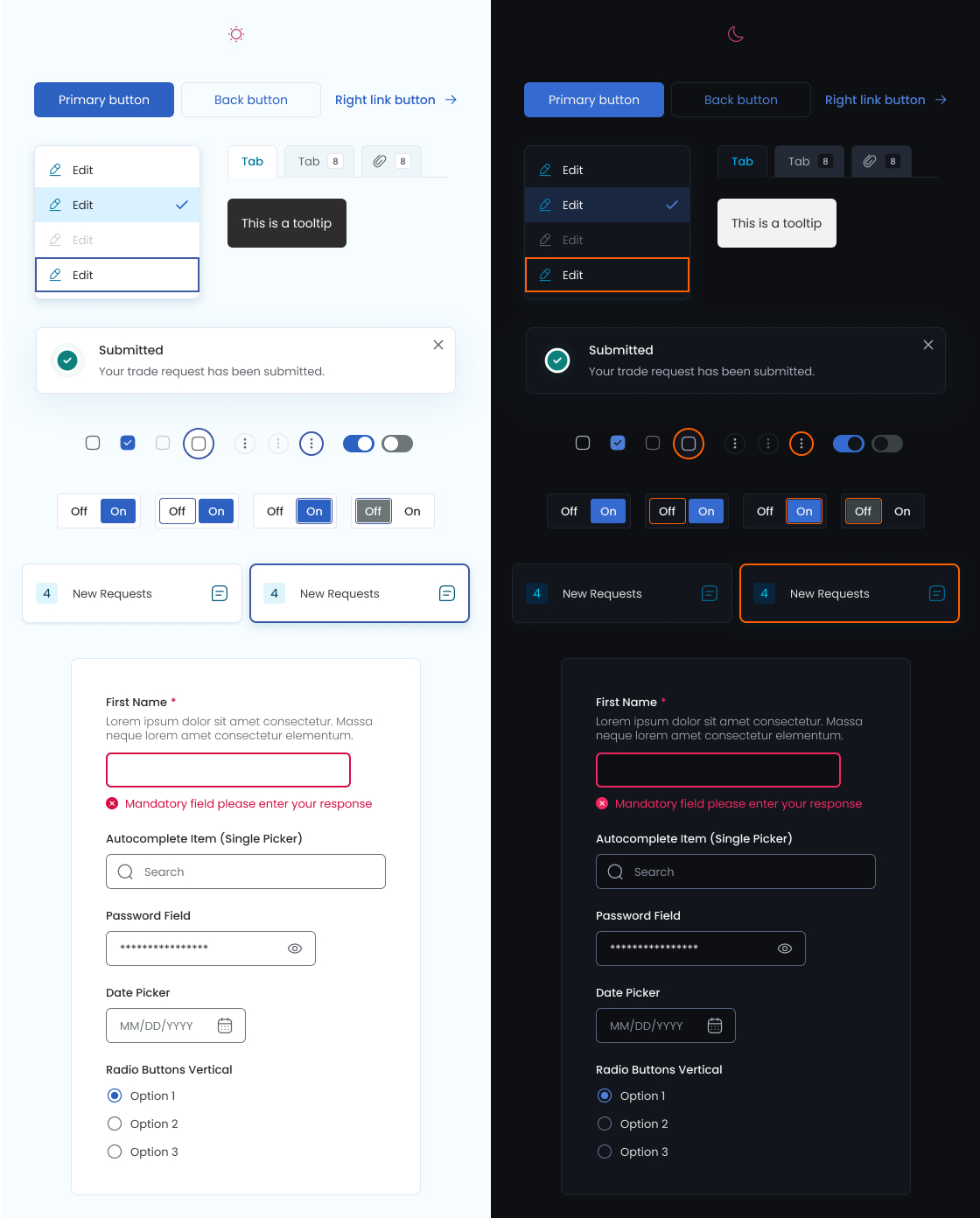
Note: The last piece of work I did before leaving the company was to create light and dark modes with a new variable/token set. There was a fun challenge here to ensure the dark mode colours were also accessible - screenshot below.
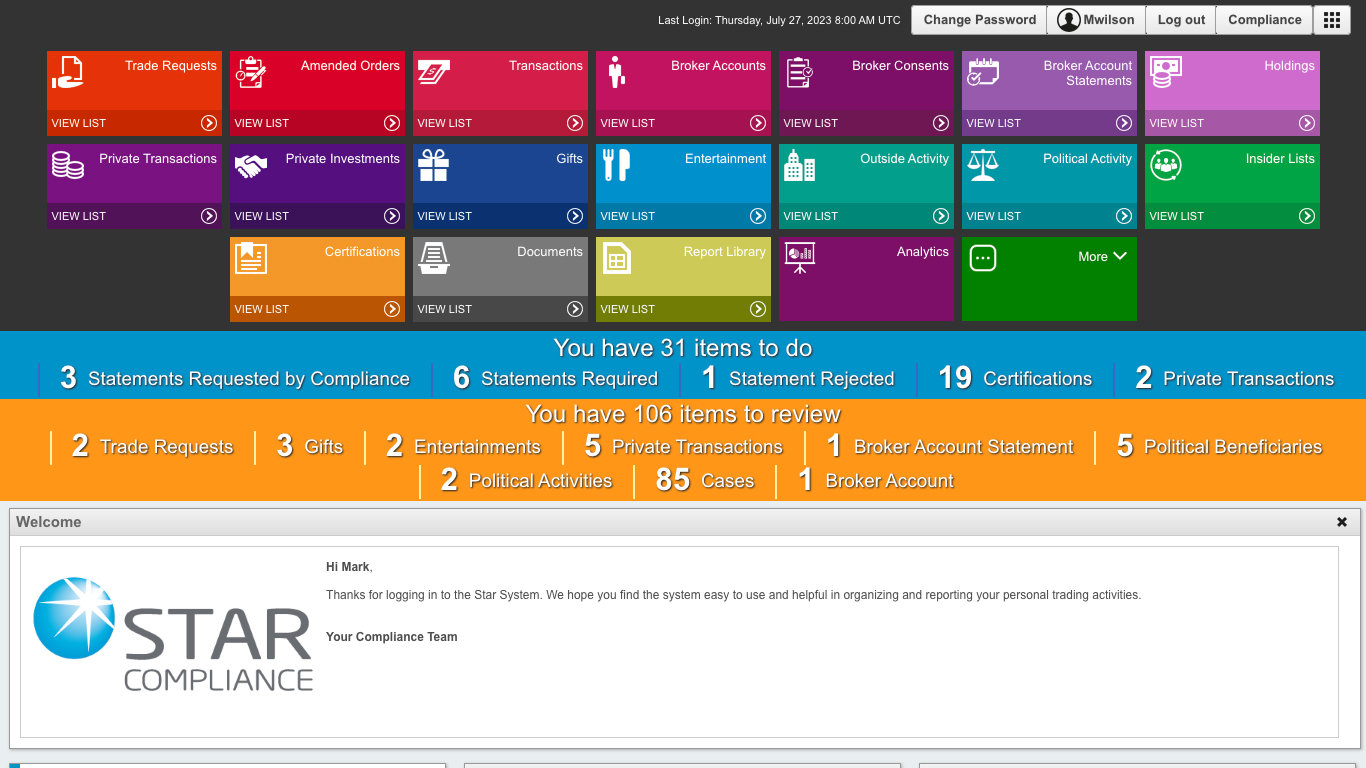
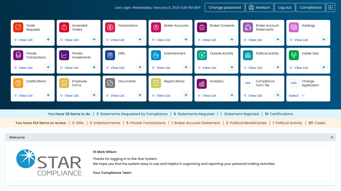
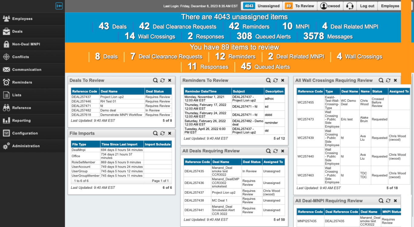
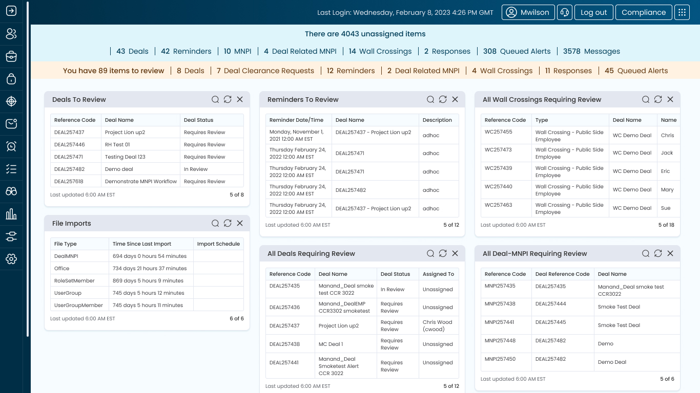
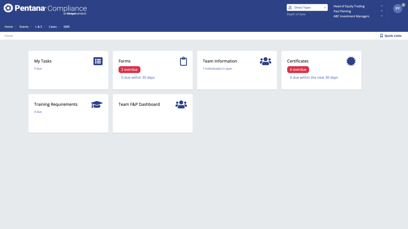
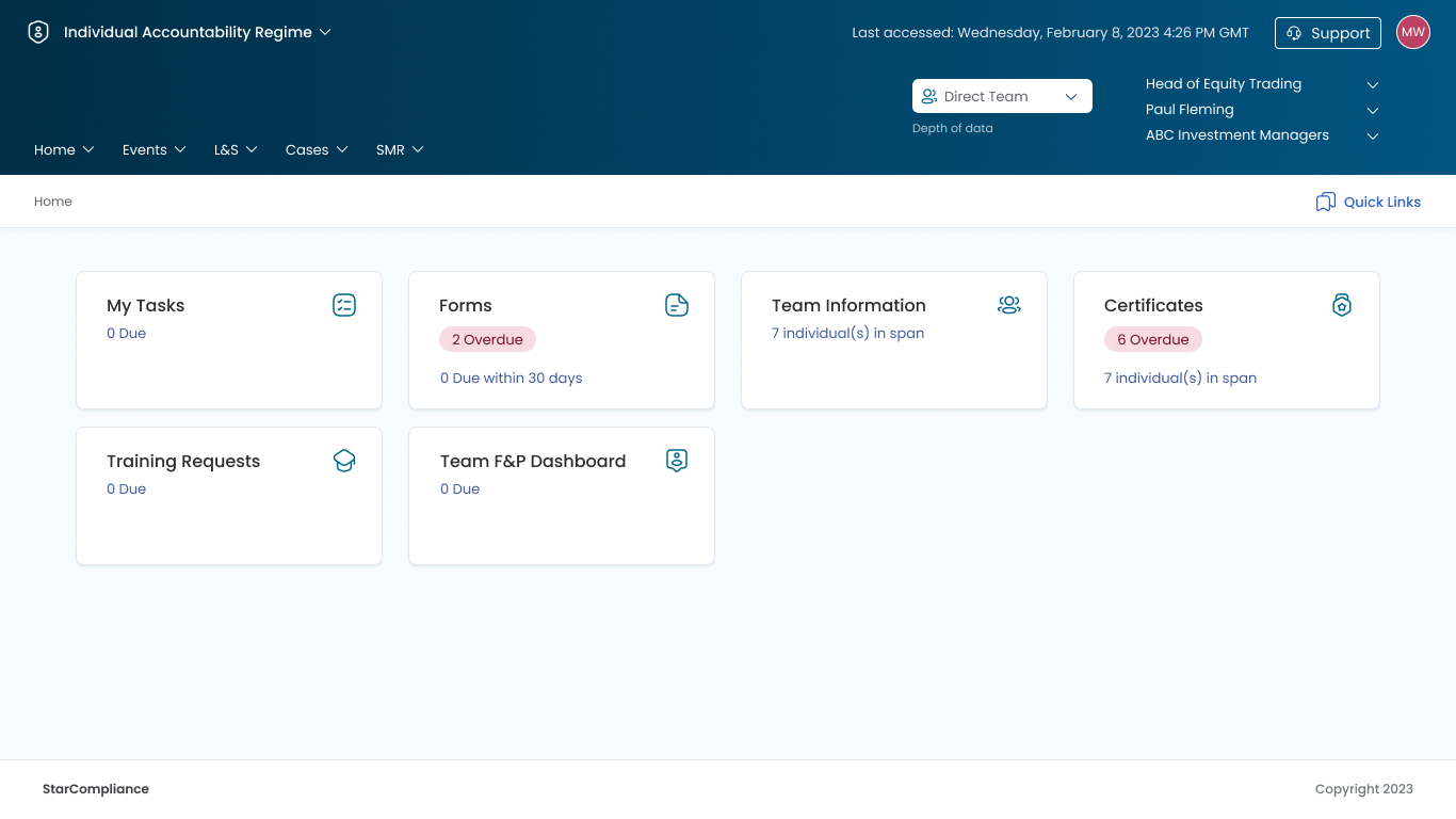
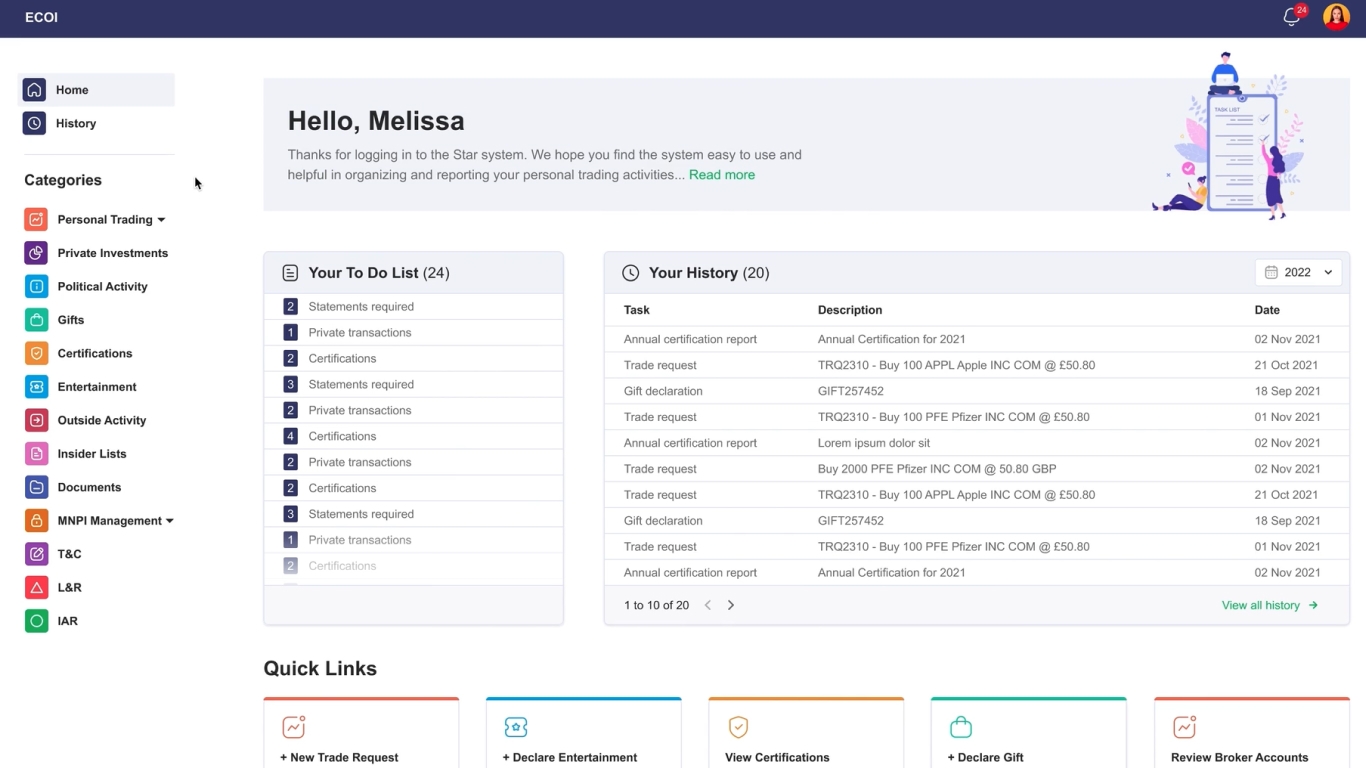
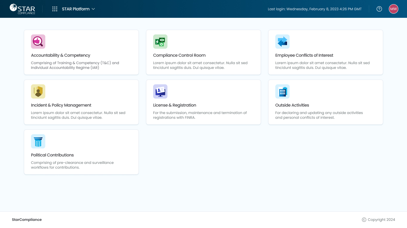
Legacy Products: Before & After
StarCompliance's legacy products, seen below, were all using varying tech stacks dating back to the 90s and early 00s. Subsequently, some of these products could only adopt the base atoms and molecules from the design system. You can see how the colours, shapes, borders, shadows and typography from the design system made these disparate products more uniform.
I have a whole project within my portfolio called Compliance Software, which showcases the new products I designed using 100% of the new design system and the components.